Last Updated on September 8, 2022
When decorating a home, many people are afraid to use anything but neutral colors. After all, choosing a paint color is like buying a new car. You have to love it 100% before you buy it so you don’t have to go through the complications of selling it after only two years.
Painting takes commitment. You don’t want to choose the wrong color because in two years you could be bored of it, or feel it no longer provides the same energy or personality to your space. If done right, though, adding color transform any room.
Check out our top picks of 2019’s trendiest colors below and see which ones you want to incorporate into your home this year.
Jewel tones
If you’re looking for a color palette that is bold and exudes personality, look no farther than jewel tones. As the epitome of a pop color, these rich shades add energy and class to living rooms, kitchens, dining rooms, and bedrooms. Plus, this color palette allows you to pick the colors you like–ruby red, dark sapphire blue, and emerald green are some of the most popular.
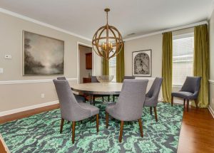
We’ve never seen jewel tones look so good in this new listing in Matthews, NC.
Dark greens
If you’re searching for a pop of color that makes a statement without hurting your eyes, use any shade of dark green to bring your space together. Jades, hunter greens or forest green shades are classic options great for walls, statement furniture, or architectural pieces. Or use it more sparingly and sprinkle the color throughout your styling pieces such as vases and wall art.
Matte black
Matte black is perhaps one of the most daring color schemes on this list but its popularity doesn’t seem to be dying out anytime soon. It makes a statement and is bold. It’s classic and timeless, so it will never go out of style. And a nice bonus, it doesn’t show dirt that easily so furniture, kitchen cabinets, and other items won’t have to be cleaned as often.
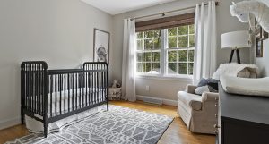
Check out how this newly-remodeled home showcases the beautiful matte black color in their nursery.
Dusty pink
This calm and subdued shade of blushy pink can help open up spaces due to its lightness and airiness. It is a great color for textiles such as curtains or throw pillows, or decor pieces like artwork. Add this color to your living room, office, bedroom, or even kitchen to add some fun flair yet freshness and serenity into your space.
Wood
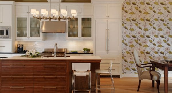
More of a material and texture than a color, wood is a perfect addition to any color palette searching for a rustic element. It can make your space more airy and homey if not overdone. While this is a common classic for flooring and pieces of furniture like side tables, adding some rustic ceiling beams or accent pieces take this color palette to the next level.
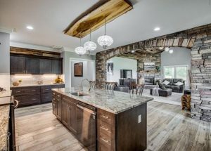
The wood ceiling and kitchen details in this East Bend, NC home look like they it was designed and styled by the farmhouse chic pros–Chip and Joanna Gaines–themselves.
Dark navy with gray hues
Dark navies with hints of gray are a great addition to every and any room in the house. Most popular in dining rooms and other entertaining spaces, it’s bold yet slightly calm and quiet. It adds an air of elegance and makes you feel regal, but it’s not too showy or over the top.
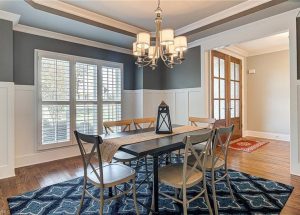
This farmhouse in Greensboro, NC uses this color scheme perfectly!
Terracotta
Terracotta is a great color to create a sense of wanderlust and inspiration. Great for organic or bohemian aesthetics, this rich shade of brown is great for furniture, rugs, or accent pieces. It’s natural and refreshing without being overpowering. Similar to burnt orange, this color scheme is great for all seasons of the year.
Berry red
This rich shade of red is elegant and classy. Reminiscent of the holidays, this color can actually be used all year round to spark joy. Great for walls, furniture, rugs, or other decorations, berry red is popping up in interior spaces everywhere. Plus, it is versatile and can be incorporated into just about any living space.
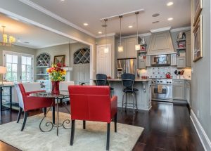
This home in Travelers Rest, SC opted to use red as an accent color in their kitchen, and it pairs pefecting with the white and gray shades in the room.
Baby blue
Often thought of as a staple nursery color for little ones, light shades of blue are becoming more popular to incorporate in other rooms throughout the house. Baby blue is a relaxing, subdued color often found in bedrooms and bathrooms.

Easy on the eye, misty blues are sure to make your living spaces less stressful and feel light and airy, as seen here in this Waxhaw, NC home.
Shades of Yellow
For a long time, yellow has been overlooked in the world of interior design. But this year, it is making a comeback. Bringing happiness and positivity into your home, yellow brightens up and livens living spaces. Whether you choose a mustard tone, pastel shades, or a bright yellow, the upbeat energy will tie your space together beautifully.
These yellow walls that flow upstairs in the office and bedroom are sure to make you smile any time you step into the space.